
December 26, 2025 - Surjan Super School Weekly Newsletter - PART 2
- SURJAN
- Dec 26, 2025
- 2 min read


SURJAN SUPER SCHOOL NEWSLETTER
WEEK OF DECEMBER 26, 2025 - PART 2
Theme: The Soft Invasion: Radical Cute as Urban Strategy
INTRODUCTION: ARCHITECTURE AS DOPAMINE
In Part 1, we discussed how to keep the city dry. In Part 2, we are asking how to keep the city happy.
The winter in New York is gray, rigid, and cold. The second series of explorations from our studio this week proposes a counter-narrative: The Soft Invasion. We are looking at "parasitic" facade retrofits that treat the building envelope not just as a barrier, but as a playful, inflatable boundary between the private interior and the public street.
If the Timber Towers were about resilience, these Pink Bubbles are about pure dopamine.
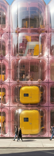
01. THE PARASITIC HUG
(Ref: The Historic Retrofit)
The most provocative study this week is the retrofit of the historical stone facade.
Typically, preservationists demand that we touch history with "lightness"—usually clear glass and thin steel. We have taken the opposite approach. We are effectively "hugging" the existing masonry with oversized, pressurized volumes.
The Contrast: Notice the tension between the ornate classical cornice and the bulbous, pink "Inflatable Membrane Pods". It creates a dialogue between the permanence of stone and the ephemerality of air.
The Section: The technical drawing reveals the logic: a steel frame support anchors into the existing floor slabs, allowing the "Translucent ETFE Cladding" to project 10 feet out over the sidewalk. This expands the interior square footage while creating a soft canopy for pedestrians below.
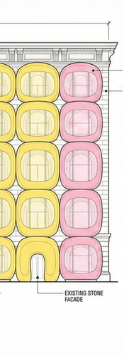
02. THE COLOR OF WARMTH
(Ref: The Yellow & Pink Grid)
Why pink? Why yellow?
In the "Grid Module" studies, we stripped away the historical context to focus purely on the psychological impact of color. The "Bubble Glazing System" creates a fish-eye lens effect on the city.
Inside, the world is tinted rose. Outside, the building acts as a glowing lantern. The "Pink Acrylic Bubbles" and "Yellow Panel Facade" reject the modernist obsession with transparency. We don't want to see the city as it is; we want to see the city as it could be—warmer, softer, and brighter.
03. THE URBAN TOY
(Ref: The Street Pavilions)
Finally, we moved to the street level with the standalone pavilions.
These structures function as "Urban Toys." The "Red/Yellow Panels" and "Dome Radius" details suggest a playground aesthetic, but scaled up for adult use (retail, lobby, circulation). They disrupt the grid. You cannot walk past the massive, tubular pink entrance without breaking your stride.
It forces the pedestrian to engage. It turns the "Main Entrance" from a door into an event.
FINAL THOUGHT: DON'T BE BORING
As we close out 2025, my challenge to you is simple: Stop fearing the cute.
"Serious" architecture is often afraid of color and roundness. But in a post-crisis world, softness is a strength. The diagram of the "Arch Structure" proves that we can be rigorous with our dimensions and structural grids while still producing something that looks like it fell out of a candy jar.
Let's make 2026 a little softer.
Stay bright,
Surjan
Professor of Practice, ASU
Founder, Surjan Super School


Comments